I have had a relationship with the 120 year old Bishopsgate Institute since 2015 when I was invited to examine their how they communicated their brand.
In 2008, a sizeable heritage lottery grant had afforded an extensive refurbishment of the Institute's building. From this work, original tiles and flooring were uncovered or replaced with reproduction materials, and the Victorian library was restored to its former glory by having any trace of the 1970s and 80s formica and fluorescent lighting stripped away.
At the time, some contemporary "designed" elements had been tacked onto the building and a style guide (with minimal explanation as to its rationale) had been left behind. Separate departmental colours had been decreed, inspirational decal quotes had been glued along the lengths of white walls in marble-floored corridors, and a website had been produced which seemed to aim to please everyone by leaving nothing out. Seven years later the colours had faded, multiple department of this relatively small organisation jealously guard "their" colours, the website was inaccessible to both staff and visitors, and no further thought had been given to how well everything was working.
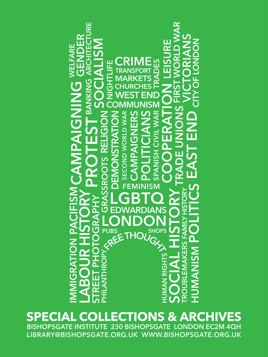
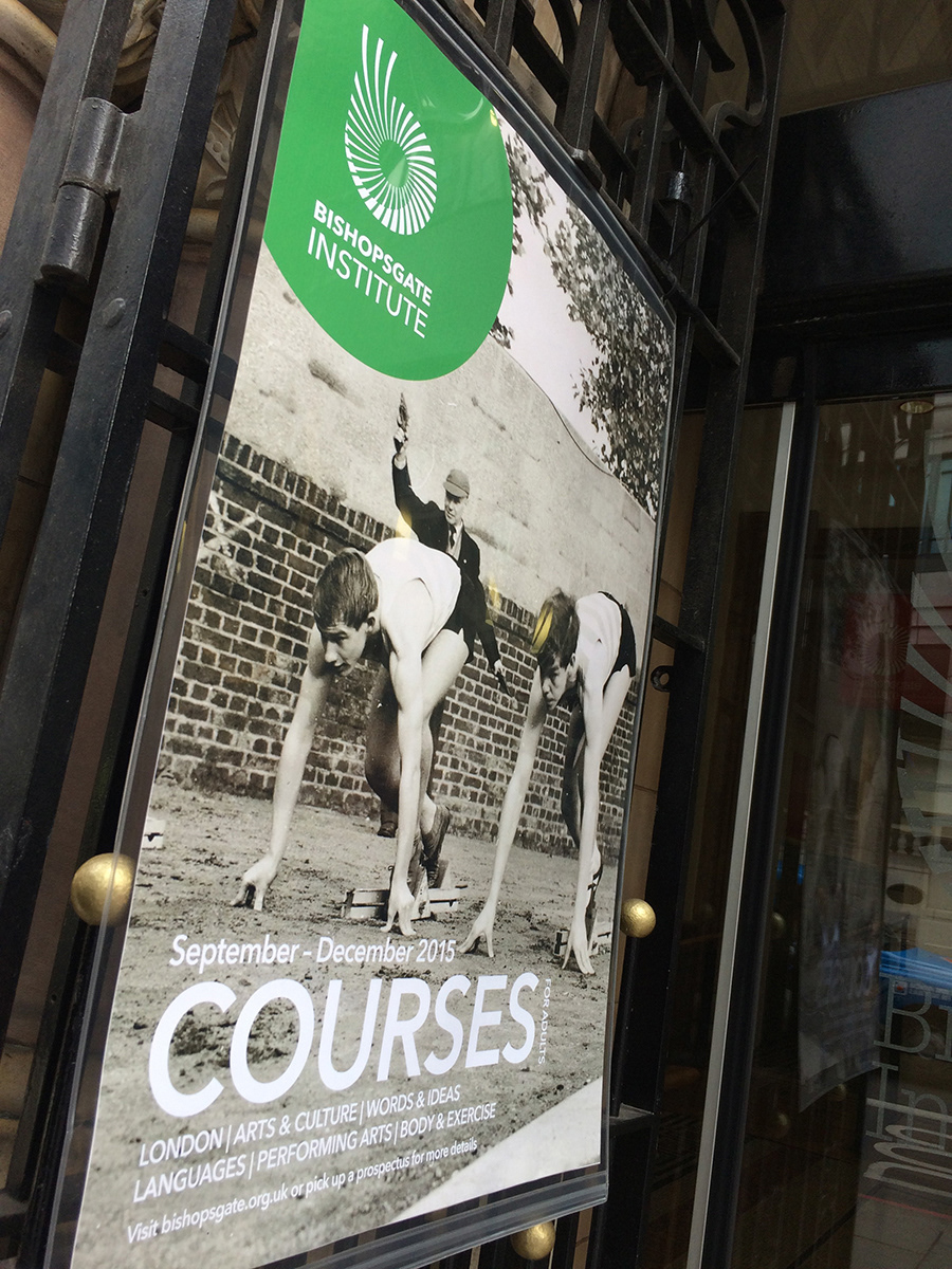
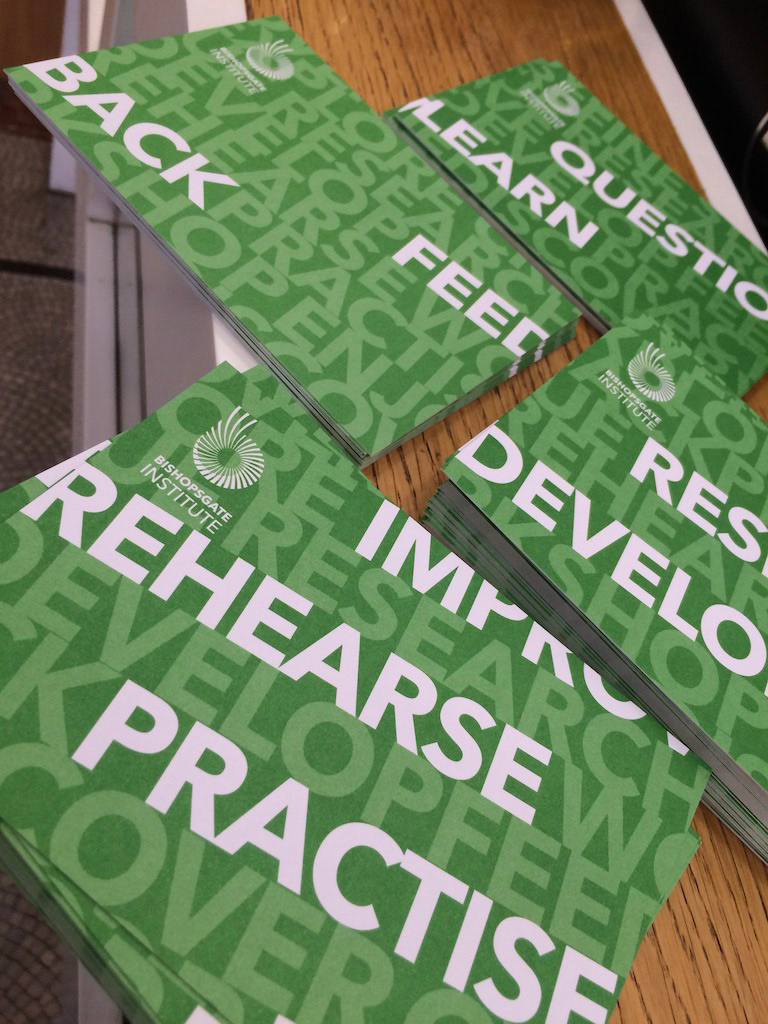
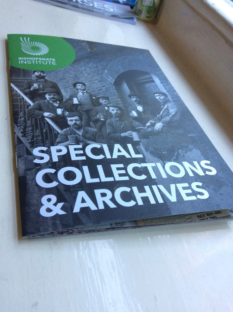
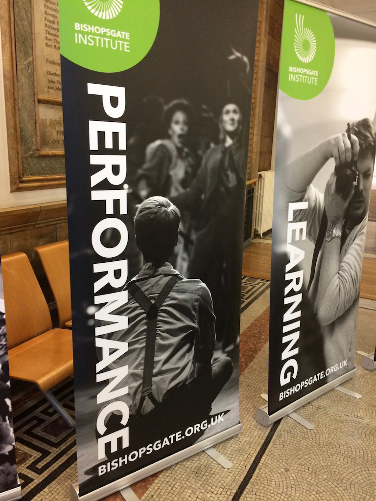
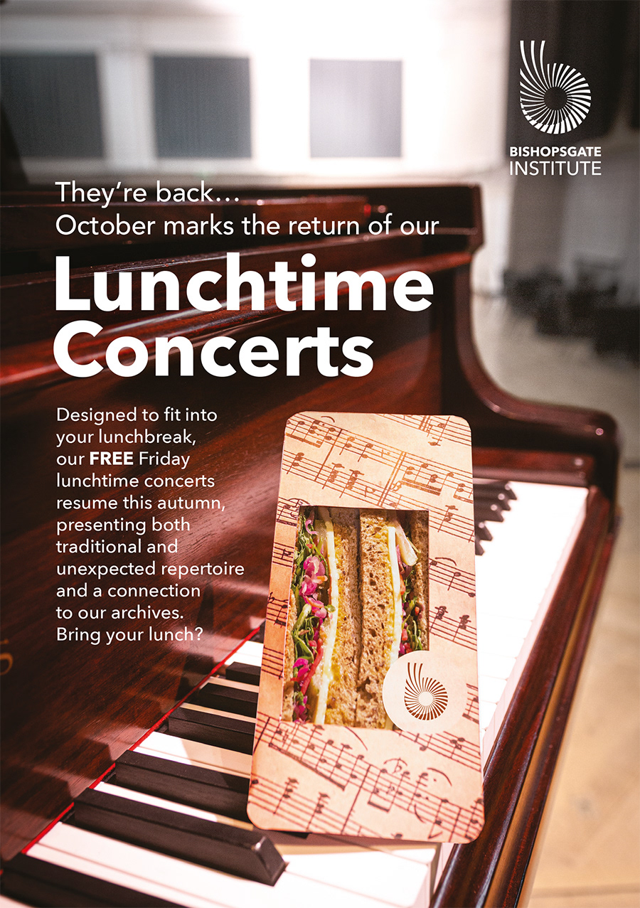
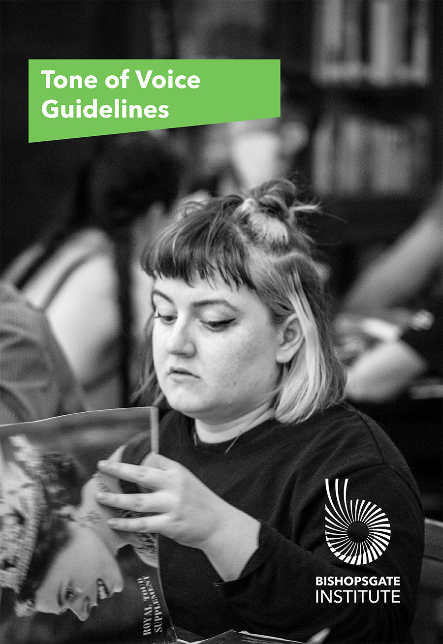
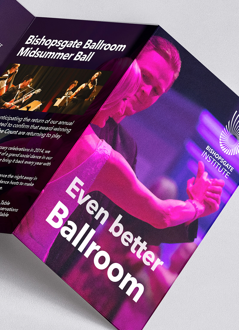
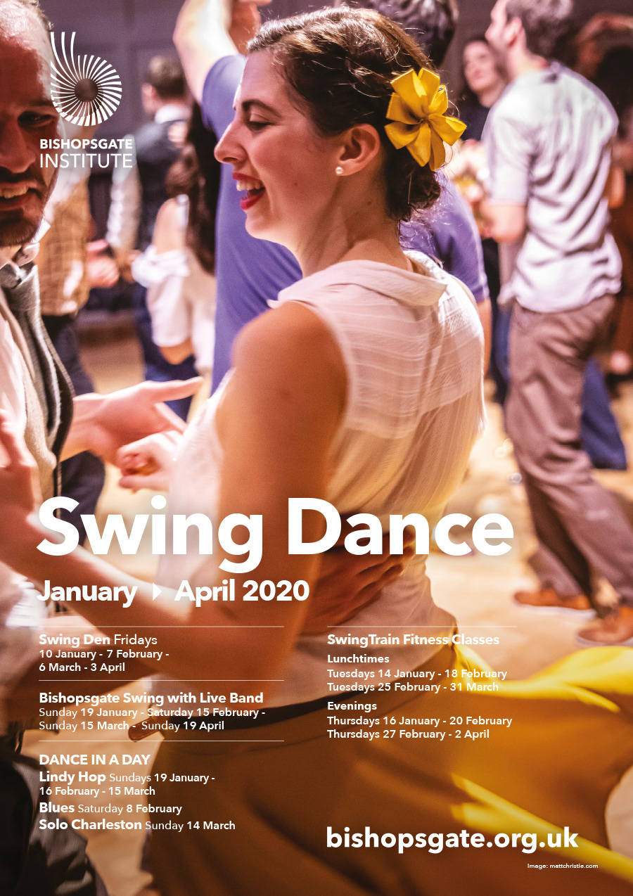
Working with the organisation I performed an "audit" of the building, its signage, its advertising, its promotional materials, its online presence, and how it presented its offer to both existing users, students, and visitors, and to potential new ones. From here we set to work creating a united visual identity that spoke boldly and married the valuable rich heritage with a contemporary look and feel, in order to convey the excitement of a cultural and educational beacon within the City of London. During and following a restructure of the organisation, I had the role of Head of Campaigns ( for a little under two years), working to establish new ways of working, new formats for promotional materials, and creating a new guide to the visual identity and brand – this time with just a little more explanation and support for those following it. (find a little bit more about this stage over on my other website)
I have since returned as a part time brand strategist and advisor (as well as an occasional designer and photographer) for almost a year, helping to corral and re shape the Institute's identity after it had been left to run wild for a few years in the real world and things had organically moved on. This work also involved working to develop the look and feel – and collaborate with developers and senior team on the UX – of the long overdue website redesign.
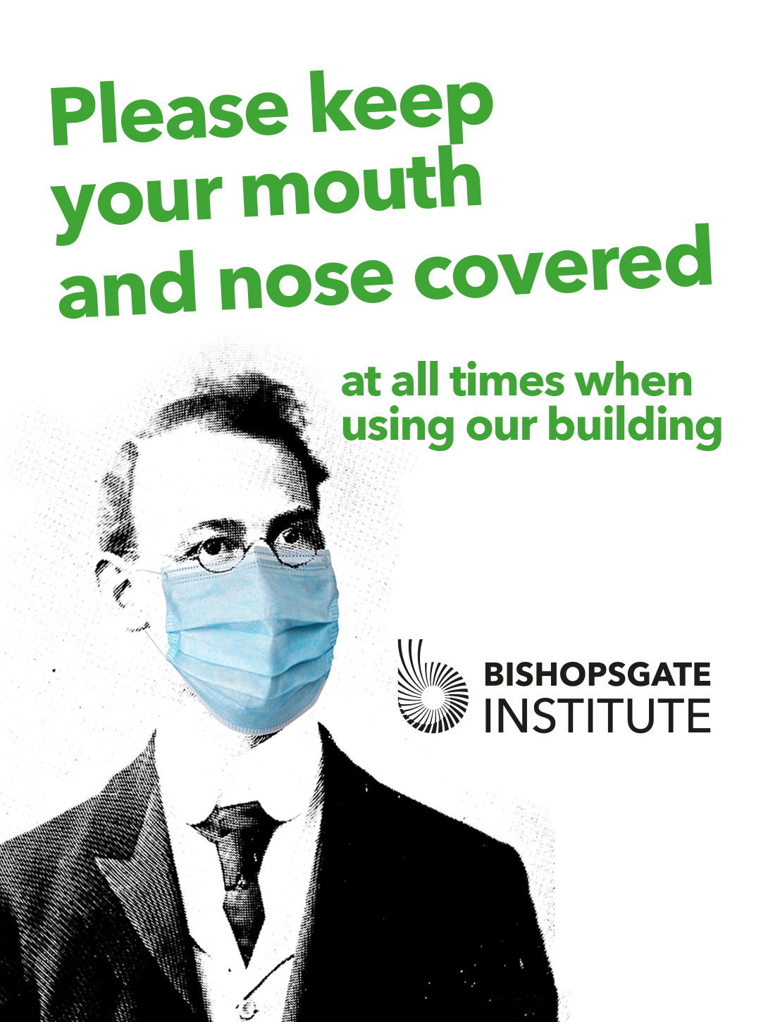
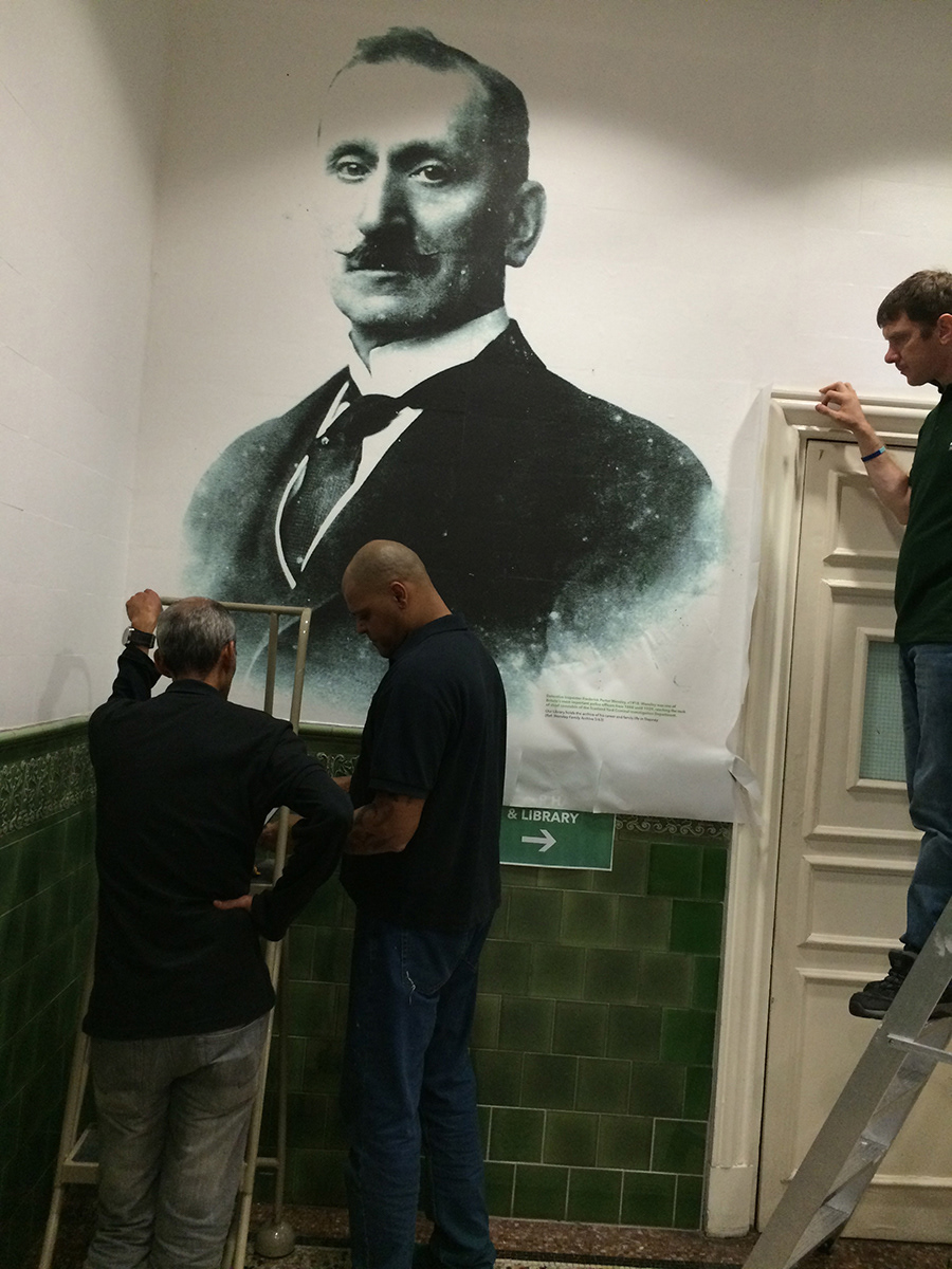
Most recently I have helped to develop signage and messaging to be used for their post-lockdown partial reopening. Knowing the contents of their extensive archive, as well as the visual identity, I was able to draw on images from within the archive and from their own history in order to create important but playful messaging which told people they were welcomed back albeit perhaps not quite with business as usual.
It's developed into a really interesting and productive relationship where I am both very familiar with the organisation and "on the outside" enough to be an objective set of eyes. It's like checking in with a good friend and finding out how we're doing and seeing what we can collaborate on next.