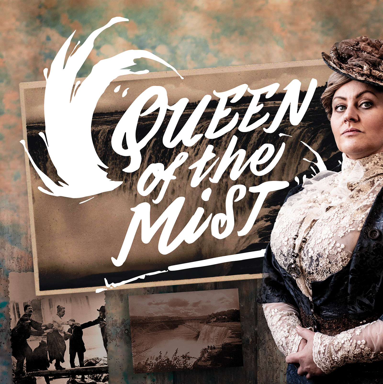
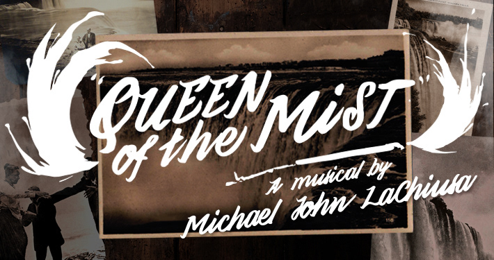
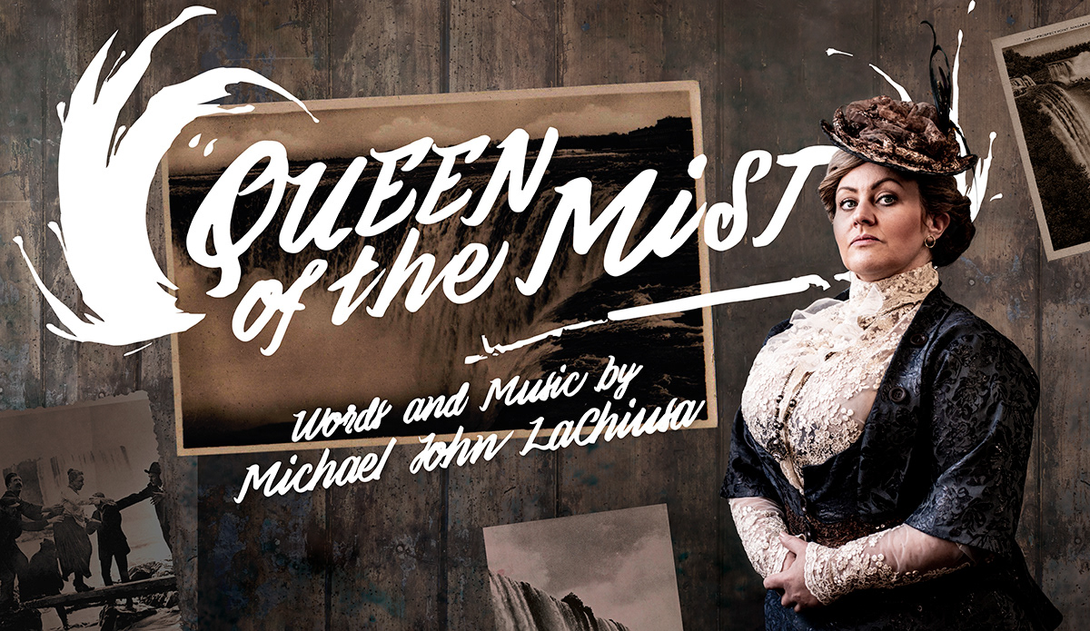
I had been working with Blake Klein whose theatre company, Pint of Wine, had grown out of his desire to produce high-quality but perhaps ignored gems of musical theatre. In the autumn of 2018 they gained the rights to "Queen of the Mist", a Michael John LaChiusa musical about the life of Annie Edson Taylor – the first person to go over Niagra Falls in a barrel and survive at the age of 63. They also had lined up the actor to play her, a trained opera singer transitioning to musical theatre, Trudy Camilleri.
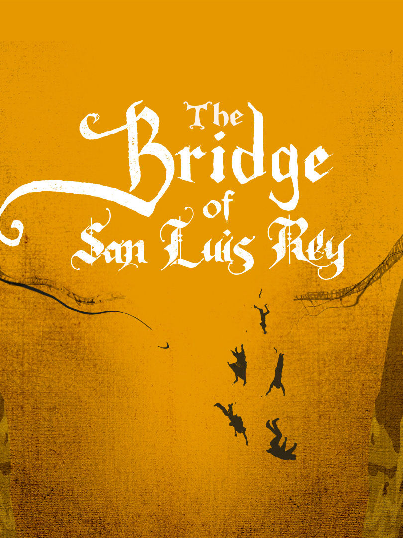
Initially designing a simple "holding" logo to accompany the announcement using Victorian playbill styling and an iconic silhouette of Edson Taylor with her famous barrel, we then set about creating the identity for the show which was to be presented in a London fringe theatre venue. The show first needed an extreme flexible but logo that could work equally well on an A5 flyer, an A0 poster, as a wide online banner advert, a small square booking button for a theatre ticket sales site, or layered onto promotional HD video content. I developed something that could work in various configurations and that possessed sufficient boldness, based on a hand-painted sign that could easily have been on the famous barrel itself.
I then needed backgrounds and textures to provide a ground for the logo sit upon, until such time as we would have character photography. Using wood (barrel) textures, sepia colours drawn from early photography, and images from postcards of Annie herself and the mighty Falls (the idea of hawking postcards of her famous deed features heavily in the show), I created artwork which could be used throughout the promotional materials (online and offline), would be used in the show programme, and that would even eventually make it onto the packaging for the recorded soundtrack.
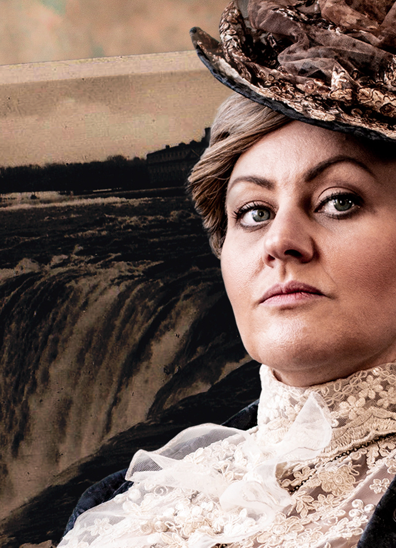
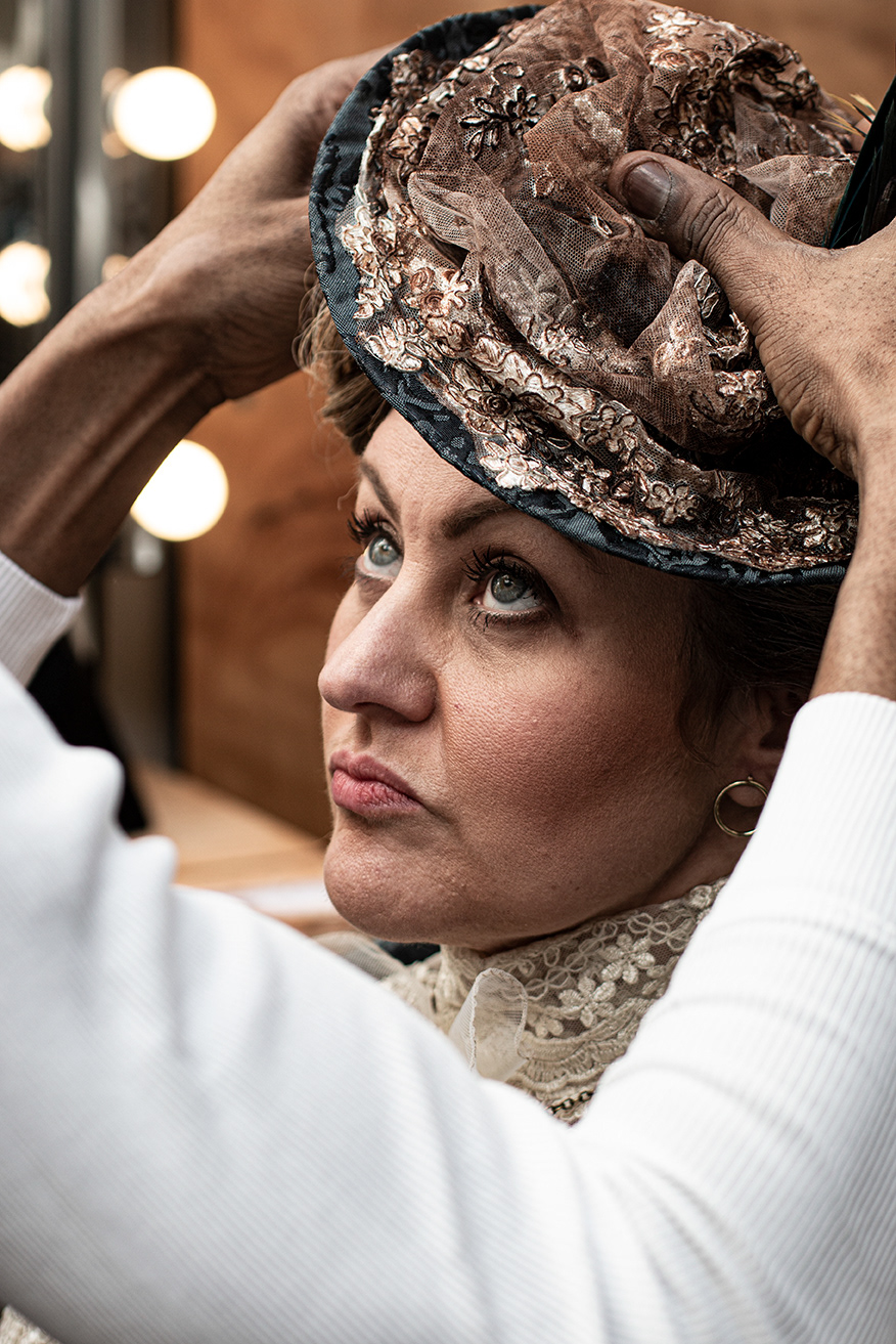
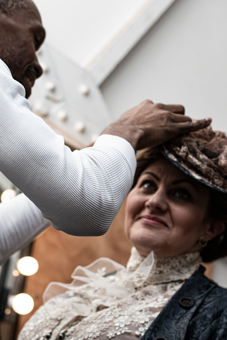
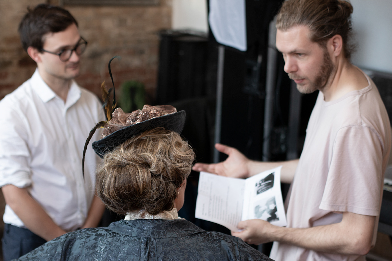
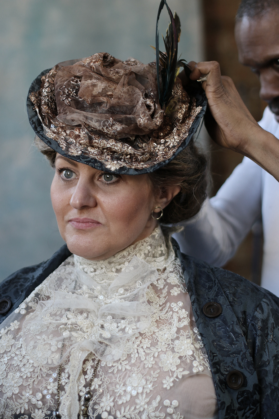
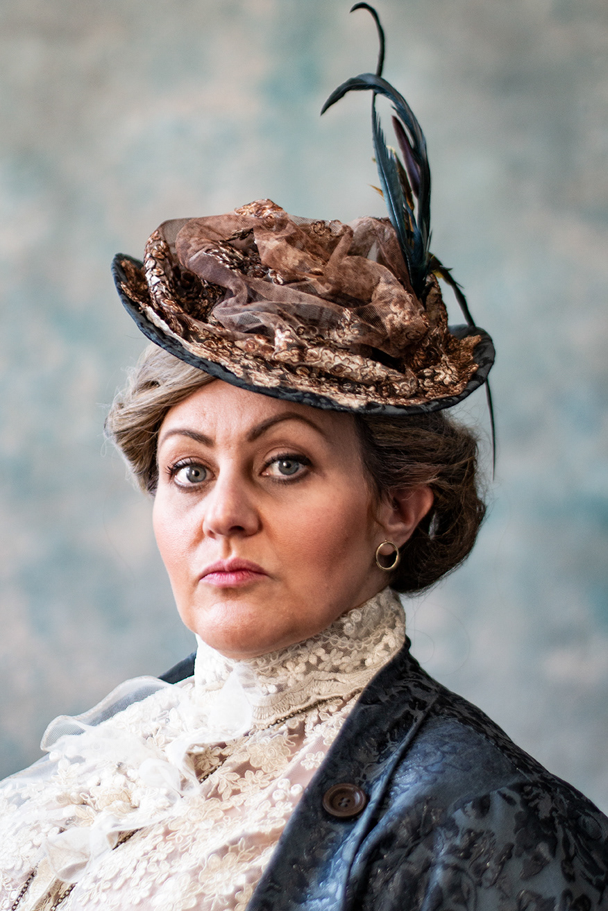
Just a brief pause then until all things aligned for a day of photography and videography with the costumed, made-up and styled star of the show,Trudy, where we would capture the main promo shots, record a teaser trailer, and generate initial video content to be use to promote the music of the musical. We had an ideal (albeit compact) space with lots of great natural light (and a background that echoed period photography) and an incredible stylist once again in Lemington Ridley. With video and sound recording necessarily taking more of the available time I had to work around the team (videographer, director,lighting, sound recording and pianist) to capture the perfect shot to use for the posters, programme and online promotional materials. Thankfully I knew Trudi from previous work (both as a fellow actor and previous photography) so I was confident she would deliver a variety of poses and great focus. Also I was in absolutely no doubt that Lemington, once again, would give me brilliant styling with which to work (and no fuzzy hair, thus avoiding hours of digitally cutting out). I got the shots (as well as some background shots of the process) and set about incorporating them into the new show poster.
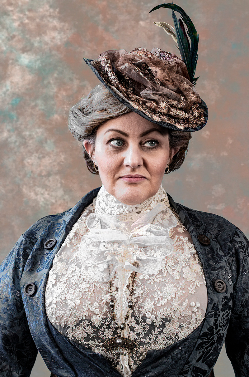
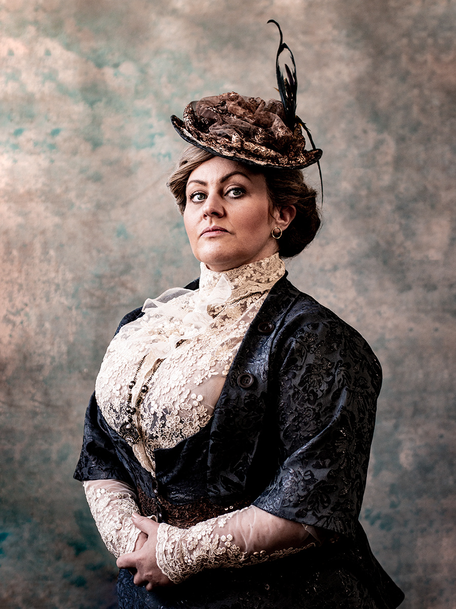
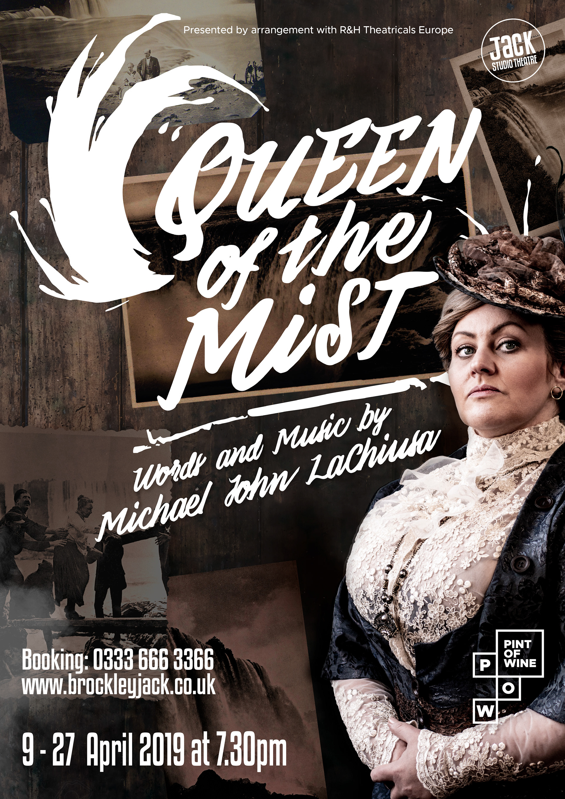
The show had a successful run at the Jack Studio theatre and was picked up for a transfer to Charing Cross Theatre. It was a chance to reflect and refresh (and allow someone's throwaway comment about things looking "a bit brown" to gnaw at my creative pride.) So... sepia... but, y'know, not brown. I love a challenge.
I found ways to brighten things and pull out colour where there were previously just tints but, hopefully I managed to hang onto an aged sepia quality whilst increasing the impact of the show artwork and making it worthy of its new Off West End status.
I also took the opportunity to make the subtlest of changes to the main photo which has hopefully never been consciously noticed. As someone who has been using Photoshop since it was released in the early 90s I am very reluctant to use it to lie in a way that does harm in the world, by making people have unrealistic expectations of beauty. I set myself a basic rule of only removing temporary imperfections or distractions. I will brighten a tired eye, remove a pimple or a mascara smudge, or "change the lighting" to diminish the severity/harshness of a wrinkle. But the wrinkle stays. On this occasion I used a very gentle nudge tool and a slight shading alteration to change the corner of the mouth from "severe" to "determined". Annie was formidable, not harsh or cruel or even simply grumpy.